Week 11 | My Prototype in Six Iterations
Plus, my reading responses to p-DPA, Troll Thread, and Tressie McMillan-Cottom's interview with Kiese Laymon.
Critical Snapshot and Six Variations of my Prototype:

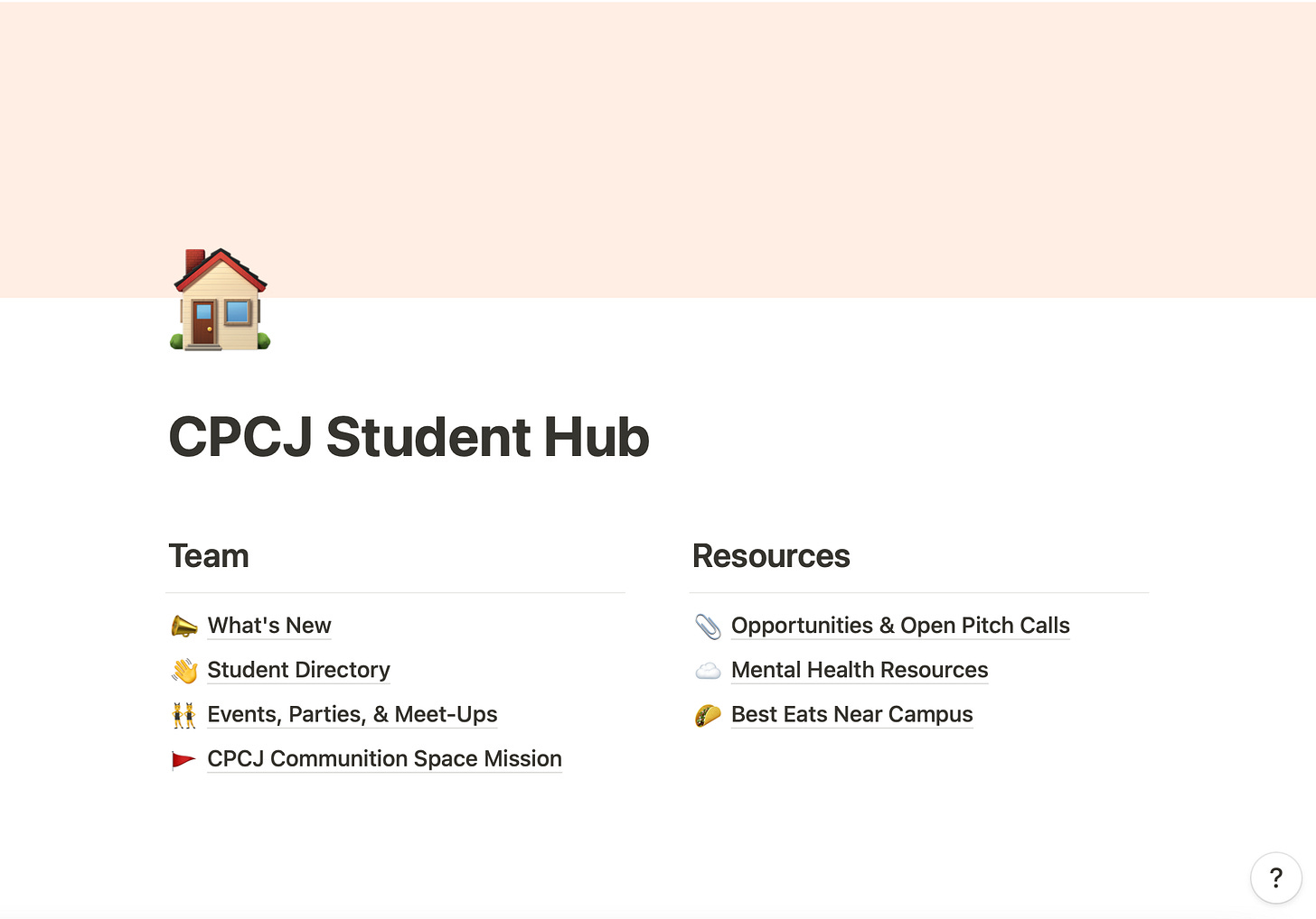
In reflecting on last week’s feedback, I have shifted to wanting to do a completely digital project. I still think there is utility in doing a booklet, a print version couldn’t be easily updated, while a digital version could.
Juliette gave me a great lead, suggesting I use a Wiki platform to build my prototype. I was unfamiliar with Wikis (other than Wikipedia), but have now looked at a few (great example here) and am very inspired by the ability for anyone to adapt the publication.
This form echoes the sentiments of my project, which is to democratize the information shared about graduate school at large, and on a smaller scale, specific programs. As you can in the variations above, I’ve changed from wanting to make a broad grad school handbook to a program-specific community hub. This is able to contain all of the info I’d want from a handbook, but can be contributed to in new ways all the time.
These screenshots reflect changes in visual structure, links, etc. I look forward to sharing more iterations.
On The Serving Library:
This image from The Serving Library completely captivated me. The reddish-pink color that is most prominent is likely why—I love this shade. These colours remind me of a contemporary book cover, one of essays or short stories. I notice a lot of bright covers these days.
Accompanying the image, a short paragraph reads:
Recently an art historian and I surprised each other: I told him that even if I were blindfolded I would know whether I was holding a tube of cadmium red or a tube of cobalt violet because of their difference in weight. He didn’t know this. He had never held pigment in his hands, and didn’t know that cadmium red is heavy and cobalt violet is light.
When I read this, I kept re-reading “He had never felt pigment in his hands.” To me, this sentence challenges the senses; the idea of feeling pigment, which we commonly associate with sight, was strange. But of course, I could be blindfolded with red-splattered hands, unable to see the color, but fully capable of sensing its weight and stickiness.
This is a nice challenge to perspective: just because we might individually be blinded from something in a given moment doesn’t mean that another person might experience that same moment entirely differently. In that sense, this image brings about a great deal of possibility.
On p-DPA:
I stopped on this image first because the cover reminded me of Joan Didion’s book covers, which I love for their simplicity, only having her name and the book title on them. This American Psycho cover felt similar; I’m captivated by the fact that a font that is quite classic, in combination with simple black and white (although there is a grey shadow there, too), can take my eye. What is it about the spacing that does that? Why doesn’t every black and white cover with no imagery pull me toward it in this way?
The description of the book on p-DPA reads:
This book was made by sending the entire text of Bret Easton Ellis' American Psycho between two GMail accounts page by page. The artists saved the relational ads for each page and added them back into the text as footnotes. In total, they collected over 800 relevant ads for the book. The constellations of footnoted ads throughout these pages retell the story of American Psycho in absence of the original text.
This was fascinating to me, as my final project is set to be a collaborative project. I love essays that are written over text and email chains, so I am intrigued by making my how-to to grad school through this medium. With this consideration, I ask: how might students share differently and more honestly about their experiences if they were doing so with other students through email or text. What might shift in the tone of the piece? As the form takes a different shape, will the message?
On Kiese Laymon and Tressie McMillan-Cottom:
Kiese Laymon is one of two of my favourite living writers, so I was thrilled to consider his conversation with Tressie McMillan-Cottom in relation to our class. My favourite section of the podcast is the excerpt McMillan-Cottom reads from a piece Laymon wrote for Vox, entitled: “What We Owe and Are Owed.” He writes:
In my own sloppy work, on and off the page, I was beginning to understand “revision” as a dynamic practice of revisitation, premised on ethically reimagining the ingredients, scope, and primary audience of one’s initial vision. Revision required witnessing and testifying. Witnessing and testifying required rigorous attempts at remembering and imagining. If revision was not God, revision was everything every God ever asked of believers.
Laymon is one of the most ethically uncompromising writers working today and his practice of revision is an ethical one. This is not simply about revising to get a better work (although that is part of it), it is about better understanding the way(s) in which art and work operate in the world. When considering his memoir, Heavy: An American Memoir, this is clear: he has written in a way that is for his audience, privileging Black folks from Mississippi over white New York editors. Just as Juliette has been encouraging us to not try to make art for everyone in this class, Laymon doesn’t try to make art for everyone. He is intentional and specific, but that’s exactly where moments of universality are found. In his constant practice of revision, he reimagines world making ethically and artistically.


